How to Read Forex Charts: A Beginner's Guide
In this article

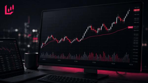
A forex chart is a visual grid plotting the exchange rate of a currency pair over time. It displays price movements through line, bar, or candlestick formats, allowing traders to analyse historical price action, identify trends, and observe market structure.
A Forex chart is a visual representation of how the exchange rate between two currencies changes over a specific period. It plots historical price movements over time, allowing traders to observe fluctuations, assess market structure and identify potential trends.
Reading a forex chart can seem confusing when you first start. However, the different lines, bars and candlesticks all represent price information that can be organised into a relatively simple framework. This guide explains the main types of Forex charts, candlestick anatomy, key chart elements and how to identify basic market trends without making the process unnecessarily complicated.
Quick Takeaways
- Forex charts show how the exchange rate between a base currency and a quote currency changes over time.
- Candlestick charts display four key price points for each period: Open, High, Low and Close (OHLC).
- Different timeframes provide different views of the market, from short-term intraday price movements to broader long-term trends.
- Chart patterns represent historical price action and market behaviour. They do not guarantee future price direction.
The Three Main Types of Forex Charts
Trading platforms typically display market prices using three main chart formats. Each provides a different level of detail depending on what a trader wants to analyse.
- Line Charts: A line chart connects closing prices from one period to the next. It removes much of the intraday detail, making it useful for getting a broad view of longer-term market direction. However, it does not show the full range of price movement within each period.
- Bar Charts (OHLC): Bar charts provide more information by displaying the Open, High, Low and Close prices for each period. A vertical line represents the full price range, while small horizontal ticks on the left and right show the opening and closing prices.
- Candlestick Charts: Originally developed in Japan, candlestick charts are widely used by Forex traders. They display the same four OHLC data points as bar charts but use a filled ‘body’ to make the direction of price movement easier to identify visually.
How Candlesticks Display Price Action
To read a candlestick chart effectively, it helps to understand the structure of an individual candle. Each candle represents a specific period, such as one minute, one hour or one day, and shows how price moved during that time.
The thick central section is known as the real body. It represents the difference between the opening and closing prices for that period. If the closing price is higher than the opening price, the body is usually coloured green or white, indicating a bullish, or rising, period. If the closing price is lower than the opening price, the body is usually coloured red or black, indicating a bearish, or falling, period.
The thin lines extending above and below the real body are known as wicks or shadows. The top of the upper wick represents the highest price reached during the period, while the bottom of the lower wick represents the lowest price.
Long wicks can indicate that price moved towards an extreme level before reversing part of that move before the candle closed. Traders sometimes describe this behaviour as price rejection, although a long wick alone does not confirm what the market will do next.

Key Elements on a Forex Chart Interface
When looking at a Forex chart, several basic elements determine how market information is displayed:
- The Axes: The vertical Y-axis, usually shown on the right-hand side, displays the exchange rate or price. The horizontal X-axis along the bottom represents time.
- Currency Pair Quote Structure: Forex is traded in currency pairs, such as EUR/USD. The first currency listed, EUR in this example, is the base currency, while the second, USD, is the quote currency. The exchange rate shows how many units of the quote currency are needed to buy one unit of the base currency. For example, if EUR/USD is trading at 1.0850, one euro is worth 1.0850 US dollars.
- Timeframes: Traders can change the chart timeframe to view price action over different periods. On a 15-minute chart (M15), each candle represents 15 minutes of price activity. On a daily chart (D1), each candle represents one trading day, providing a broader view of market structure. Multi-timeframe analysis involves reviewing higher timeframes to understand the broader market direction before using lower timeframes to assess potential entry points.
- The Hidden Spread Cost: Depending on the platform and chart settings, a chart may display the bid price or another reference price, such as a mid-market price. However, opening a trade involves the bid-ask spread — the difference between the buying and selling prices. You'll often notice a newly opened trade starts with a small unrealised loss. This can happen because the spread is reflected in the execution price even when the full cost is not immediately obvious from the historical chart.
Identifying Basic Market Structure: Trends and Ranges
Chart reading can help traders classify market conditions into three basic structures:
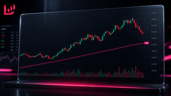
- Uptrend: An uptrend is characterised by a series of higher highs and higher lows. Price continues to fluctuate, but the broader direction moves upwards as buying pressure outweighs selling pressure.
- Downtrend: A downtrend is characterised by a series of lower highs and lower lows. The broader direction moves downwards as selling pressure outweighs buying pressure.
- Sideways / Ranging Market: A ranging market occurs when price moves between relatively horizontal areas of support and resistance. Support is an area where buying interest may slow or temporarily halt a decline, while resistance is an area where selling pressure may slow or temporarily halt a rise.
Chart analysis provides a visual framework for studying historical price behaviour. Technical analysis uses past market data to assess patterns and trends rather than providing certainty about future market movements, as discussed in the CFA Institute technical analysis standards.
Common Pitfalls When Reading Forex Charts
- Chart Clutter: Adding too many technical indicators, such as moving averages, RSI and MACD, can make a chart difficult to interpret and obscure the underlying price action. A cleaner chart can make it easier to focus on market structure.
- Timeframe Bias: Looking only at a one-minute or five-minute chart can make short-term price noise appear more significant than it is. Checking higher timeframes can provide useful context for the broader market trend.
- Confirmation Bias: Traders may search for chart patterns that support an existing view of the market rather than assessing price action objectively. This can lead to selective interpretation of technical signals.
Reading Forex Charts with Clarity
Learning to read Forex charts is a fundamental part of understanding how currency prices move. By learning basic candlestick anatomy, recognising common market structures and comparing different timeframes, traders can interpret historical price movements more clearly.
However, chart reading is an analytical tool rather than a reliable prediction of future price direction. Trading leveraged products such as CFDs involves significant risk of capital loss, and market prices can move quickly and unpredictably.
A structured approach combines clear chart analysis with defined risk management rules. For a broader look at how traders use chart analysis alongside execution and risk controls, see our guide to CFD Trading Strategies.
FAQ
What is the easiest way to read a forex chart?
The simplest method is using a candlestick chart on a daily or four-hour timeframe. Focus on basic price direction by identifying higher highs and higher lows for uptrends, or lower highs and lower lows for downtrends, rather than cluttering the screen with multiple technical indicators.
What do red and green candles mean on a forex chart?
A green (or white) candle is bullish, meaning the exchange rate closed higher than it opened during that period. A red (or black) candle is bearish, meaning the exchange rate closed lower than its opening level.
Are forex charts based on bid or ask prices?
Most forex charting platforms display the bid price by default, which is the price at which you sell. When buying a currency pair, your order executes at the ask price, which includes the broker's spread cost above the displayed chart level.
What is the best timeframe to read forex charts for beginners?
Higher timeframes like the Daily (D1) or 4-Hour (H4) charts are ideal for beginners. They filter out short-term market noise and intraday fluctuations, offering a clearer view of broader market structure and prevailing trends.
Can forex charts predict future price movements with certainty?
No, forex charts show historical price activity and market sentiment rather than guaranteed future direction. Technical analysis helps map probabilities, but market risk remains, and unexpected economic events can alter price trends instantly.